

Procreate Lettering: Leverage the Multiply Effect for Stunning Risoprint Art with Liz Volpi
Are you ready to elevate your Procreate lettering game? Liz Volpi, the Women of Type Artist in Residence for December 2023, unveils her skills to creating mesmerizing risograph effects using Procreate. In this guide, she walks you through the step-by-step process of leveraging the Multiply effect to craft vibrant and dynamic layered artworks. Let’s delve into the world of Procreate lettering and that risoprint magic!

Firstly, the key to using this technique is leveraging the Multiply effect in your layers. So, make sure that you turn that effect on in your layers panel. See below for instructions on how to do that, or skip to the next step if you already know.
How to turn on the Multiply effect in Procreate:
With your artwork file open, tap the layers button in the top right corner of the screen (icon of two overlapping squares). Your layers menu will appear in a drop-down menu. The default layer setting is “Normal”, which is represented by an “N” on your layers. Tap the “N” and a dropdown menu will appear with the opacity settings for that layer. If you tap “Darken” at the top of this menu, the menu will shift down and reveal the “Multiply” setting listed above “Darken.” Tap “Multiply” to select it! Now, your layer is in Multiply mode.
Choose a Color Palette & Test It:
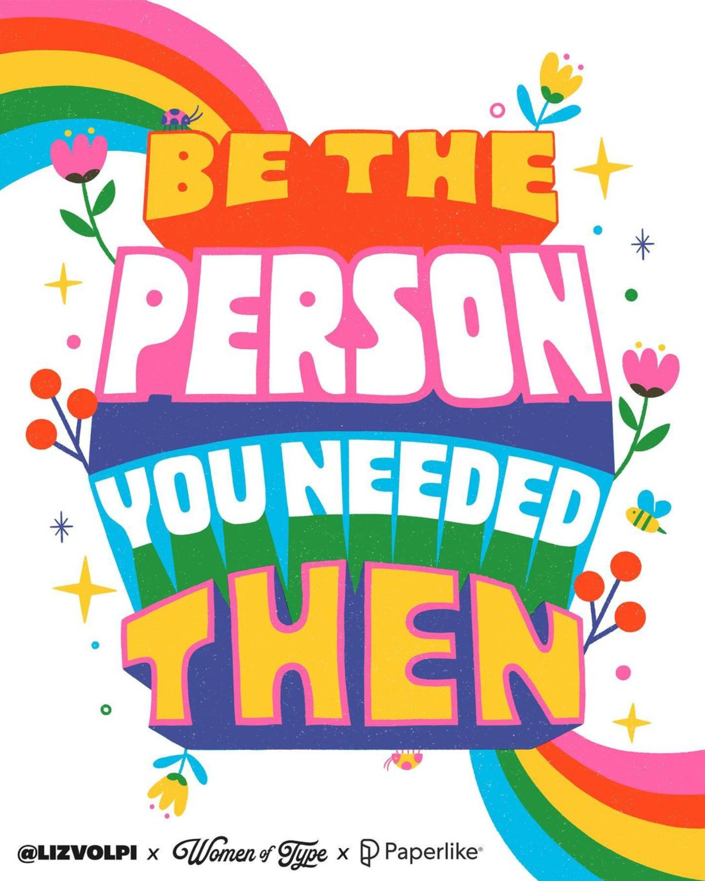
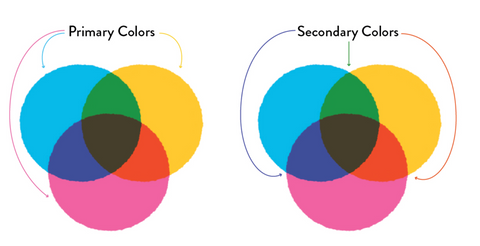
Next, it’s important to choose a solid color palette that will yield the hues you want when your layers overlap. For this piece, Liz chose magenta, cyan and a sunflower yellow as her three primary colors. When they overlap, they create purple, red-orange, and green—our secondary colors. When used together, we've got enough colors to make a rainbow! To test your color palette, Liz suggests creating a layer for each of your three primary colors—and remember to set those layers to Multiply! In the first layer, draw a circle with the first hue. In the second, draw a circle in your second hue that partly overlaps the first one. In the third layer, draw a circle in your final hue underneath but partly overlapping the first two. The areas in which these primary colors overlap are your secondary hues.
Draw Your Layered Art:
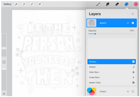
Next, you’ll start drawing out your artwork! Liz suggests having a line sketch of your idea prepared as a guide, which she drops into its own layer. Keep this as your top layer with the opacity turned down to around 14% and the Multiply setting on. This way you can still see the sketch and use it as a guide, but it isn’t interfering too much as the final art is developed.
The approach for developing final art with layered colors will be similar to the process for creating secondary colors in our color palette. To achieve the effect, it’s important to utilize multiple layers—with the Multiply effect enabled—and strategically overlap primary colors to develop secondary colors. See below for some examples of art elements broken into their overlapping layers.
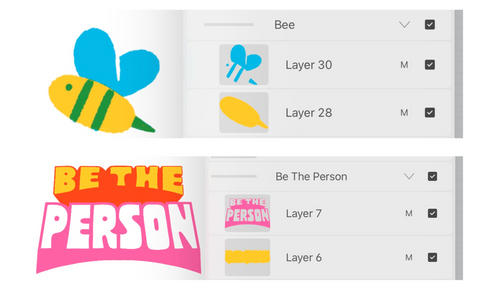
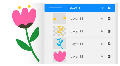
Additionally, you don’t have to keep all elements of one hue on the same layer if you don’t want to. For example: you can have several layers with blue elements rather than all your blue elements in the same layer. However, Liz suggests avoiding mixing primary colors in the same layer together. Also, if you want to sneak a few “Normal” layers in there without the Multiply effect, we won’t tell! Depending on what you are doing, it could be helpful to have a few that do not have this effect. For example, using white lettering atop a big ol’ block of color as you see in the letters for this piece.
As with any technique, you’ll learn a ton as you practice - including your very own tips and tricks. Give this technique a go and tag @womenoftype and @lizvolpi in your post so we can check out your work!
Unlock the power of Procreate lettering and risoprint artistry with Liz Volpi’s Multiply effect technique. Elevate your creations and let your imagination run wild!